Styles
Custom CSS for individual elements. Works globally and per item.
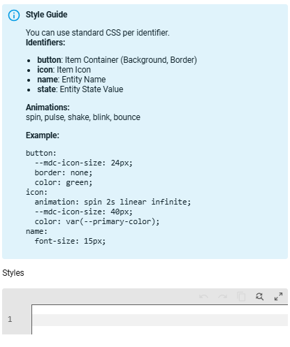
- styles.card: CSS for the entire card
- styles.button: CSS for the buttons
- styles.icon: CSS for the icons
- styles.name: CSS for the names
- styles.state: CSS for the states
- styles.count: extra CSS depending on the item count (per item only, see below)
Styles by Count
Domain, device class and smart group items can change their look depending on the number shown on the item. Add a count list with levels to the item's styles. Each level has a min and any of button, icon, name, state. The highest level whose min is reached wins and is added on top of the normal styles.
customization:
  - type: light
    styles:
      icon: "color: var(--primary-color);"
      count:
        - min: 3
          icon: "color: orange;"
        - min: 6
          icon: "color: red; animation: pulse 1s infinite;"
          button: "background: rgba(255,0,0,0.1);"
Available Animations
spin, pulse, shake, blink, bounce