Popup / Dialog
Displays all entities of a domain or device class in a custom popup with tile cards.
Info
Almost all domains have specific tile card options set to be more useful in popup.
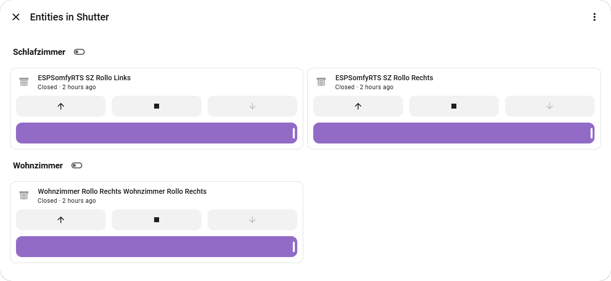
- Display: Renders the default HA popups with tile cards calculated from status card
- Area Grouping: Groups entities by their area by default
- Smart Actions: Lets you toggle between "on" or all entities, turn off all at once, turn of all by area
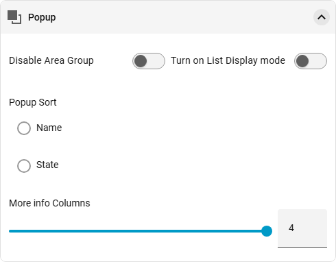
- Display Settings: Sort by name or state, responsive layout 1-4 entities per column
- Browser Actions: Back buttons and swipe gestures closes popup
Interactions with other settings
Some settings also affect the pop-up settings, even though they are primarily intended to configure the card itself.
This is done withe the 'Enable Total Entities' setting. It will show all entities no matter the state.
You can also edit the card used in popup. You need to edit the customisation for the domain, device class, extra entity or smart group. Custom cards are also possible but not all are tested.

customization:
  - type: Group1
    popup_card:
      type: button
      entity: switch.buero_pc
  - type: light
    invert_state: "false"
    popup_card:
      type: custom:bubble-card
      card_type: button
      button_type: slider
Editor Settings
| Option | Description |
|---|---|
| Columns | Number of columns in the popup (1-4) |
| Popup Sort | Sort by name or state |
| Disable Area Group | Disable area grouping |