Display Mode
Choose how the items are displayed. standard is the default.
| Display mode | Look |
|---|---|
standard |
Round icon, name and state below |
badge |
Compact: icon with a count badge, persons show a home/away icon |
chip |
Pill: icon on the left, name and state stacked on the right |
- Global:
display_modeon the card applies to all items - Per Item: set
display_modein a domain, device class or smart group customization to override the card display mode - Square: with
square: true, chips get rounded corners instead of a full pill - Scrolling: chips scroll sideways like the other display modes;
no_scroll: truewraps them into rows
Breaking change in 4.0
badge_mode: true was removed. Use display_mode: badge instead, on the card and per item.

Editor Settings
| Option | Description |
|---|---|
| Display mode | Standard, Badge or Chip (global or per item) |
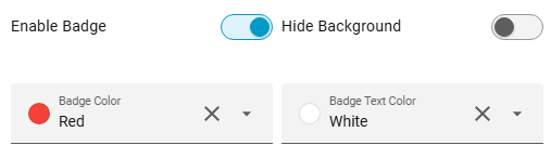
| Badge Color | Badge color, shown when the display mode is Badge |
| Badge Text Color | Badge text color, shown when the display mode is Badge |