Device-Class Items
For Binary Sensor, Cover and Switch, entities are split by device class. Format in content: "binary_sensor - motion", "cover - window".
- Auto Grouping: Automatically split by device class within the domain
- Domains: binary_sensor, cover, switch
- Format:
domain - device_class
Available Device Classes are:
| Domain | Device Class |
|---|---|
| Binary Sensor | Battery |
| Binary Sensor | Battery Charging |
| Binary Sensor | Carbon Monoxide |
| Binary Sensor | Cold |
| Binary Sensor | Connectivity |
| Binary Sensor | Door |
| Binary Sensor | Garage Door |
| Binary Sensor | Gas |
| Binary Sensor | Heat |
| Binary Sensor | Light |
| Binary Sensor | Lock |
| Binary Sensor | Moisture |
| Binary Sensor | Motion |
| Binary Sensor | Moving |
| Binary Sensor | Occupancy |
| Binary Sensor | Opening |
| Binary Sensor | Plug |
| Binary Sensor | Power |
| Binary Sensor | Presence |
| Binary Sensor | Problem |
| Binary Sensor | Safety |
| Binary Sensor | Smoke |
| Binary Sensor | Sound |
| Binary Sensor | Tamper |
| Binary Sensor | Update |
| Binary Sensor | Vibration |
| Binary Sensor | Window |
| Cover | Awning |
| Cover | Blind |
| Cover | Curtain |
| Cover | Damper |
| Cover | Door |
| Cover | Garage |
| Cover | Gate |
| Cover | Shade |
| Cover | Shutter |
| Cover | Window |
| Switch | Outlet |
| Switch | Switch |
Editor Settings (per Device-Class customization)
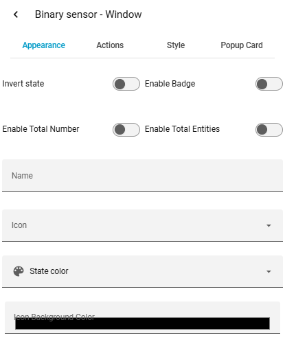
| Option | Description |
|---|---|
| Name | Change display name of the device class |
| Icon | Change icon of the device class |
| Color | Change icon color |
| Icon Background Color | Icon background color (RGBA with transparency) |
| Invert State | Show "off" instead of "on" (e.g. for windows: closed instead of open) |
| Enable Total Entities | Show all entities instead of "on" entities only |
| Enable Total Number | Show total count (e.g. 1/7 windows open) |
| Badge Mode | Compact display: icon + badge count only |
| Badge Color | Set individual badge color |
| Tap Action | Action on tap (toggle, more-info, navigate, url, perform-action, none) |
| Hold Action | Action on hold |
| Double Tap Action | Action on double tap |
| Styles | Custom CSS |
| Popup Card | Change card type shown in popup for specific device class |